How has the significance of the colour blue varied over time and across cultures?

For the main body and subject of my essay I am going to be exploring the contextual and cultural importance the colour blue has played. I want to look into Renaissance/Baroque artworks and make connections between colour and biblical meaning, are there any? I also want to look deeper in what the Catholic Church thinks and believes about colour, what is spoken about in Scripture. At the time the church were some a the few patrons with the amount of money to support and commission these artworks. I also want to look into Neoclassical/Romantic artworks, how has colour changed meaning, has it? Is there a huge jump within religious paintings being produced? Is blue used purely for the pleasure of the colour on the pallet? And finally I want to look into modern uses of blue, did it fall out of fashion? Blue has been one of the few colours that no mater the person it is always a preferred hue over all others, for this essay I have selected some of my favoured blue works to discuss and analyse. And finally is there any link between blue becoming a favoured pigment and the mental health of the artists? To answer this I want to look at Picasso and van Gogh and their influences and uses of blues within their works.

1640-50
Fig.1 Sassoferrato, The Virgin in Prayer

The virgin in prayer, by Giovanni Battista Salvi, called Sassoferrato from 1640-1650, is now located in the National Gallery, London. The main medium in this painting is oil paint on canvas with the dimensions 73 x 57.7 cm. This painting is a popular design, known in at least two other paintings by Sassoferrato. This work showing the Virgin at prayer is one of four paintings by the artist. The main focal point and emphasis is on the painted robes and the blue cloak, in which Sassoferrato used ultramarine. Although this is painted in the portrait style, the main feature of this painting is the hands in prayer, as the face is covered in shadows by the robes.

This painting is full of high level skill and contrast, when first looking at this image I am drawn into the great detail in very ruffle and crease of the drapery, the pure white veil and the ultramarine cloak. The use of a black background highlights and illustrates how the Virgin is the main, and only focal point in the painting. Light and shadows are one of the main style choices that has been used in this artwork, the shadows that cover the face can bend towards the analysis that the face of the Virgin is unimportant, but the devotion to the Lord is stronger, as emphasised by the hands in prayer in full view, and illuminated against the white robe backdrop. Almost all of the white rob is illuminated by the bright, and almost unnatural light, this robs becomes a beacon of light itself when against the black background.

The use of colour in this painting is very deep and meaningful, when looking into biblical paintings there are four colours that are primary used, red, blue, white, and gold. At the time gold was seen as being a pigment in itself and used only on the most divine paintings, for example, on the halos over heads. Blue holds very deep biblical meanings, the colour is close linked to the people of Israel, and the colour is even spoken in the book of Numbers.

“38 Speak unto the children of Israel, and bid them that they make them fringes in the borders of their garments throughout their generations, and that they put upon the fringe of the borders a ribband of blue:

39 And it shall be unto you for a fringe, that ye may look upon it, and remember all the commandments of the Lord, and do them ; and that ye seek not after your own heart and your own eyes, after which ye use to go a whoring:” (Numbers, 15:38-39)

When looking at this quote we can see that the colour blue is close linked to understanding and following the Lords commandants and wishes. Blue is the colour of obedience, of following and doing bidding, but the colour is also linked to the Lord. Blue then takes on the connotations of the divine. Within iconography on traditional early Christian art, blue is the colour of the sky, and therefor viewed as a heavenly colour, so when blue clothing is worn by idols such as the Virgin Mary, blue becomes divine, and represented her transcendence.

larger
Fig. 2 Sassoferrato, The Virgin in Prayer, 1640-1650

But blue isn’t the only colour used, perhaps the smallest detail but no-less the most crucial is the red undergarment. Red is an earthy colour, but also the colour of blood. Even in some passages of Scripture red, or scarlet as it is often referred to, is the colour of sin. This is a very important detail to note when looking at the above image of the Virgin Mary, her robes are painted in three out of the four most symbolic colours for this style of panting.

“’Come now, and let us reason together,’ says the Lord, ‘though your sins are like scarlet, they shall be as white as snow; though they are red like crimson, they shall be as wool.’” (Isaiah, 1:18)

Often within small bible verses that hold great meaning and messages there will be great emphasis on a single motif, in this case the colour red. When we unpick this quote we can see that all red sins will turn white, they will be absolved and purified by the Lord. This is interesting to note within the painting, Mary is wearing a duller red robe underneath all others, but the white and blue robes cover her fully. This could be a nod to the face that Mary was not divine before she carried Jesus and her divinity only comes from the Lord. This is also supported by the idea of divinity surrounding her always, and that although she may inherently sin she will be absolved and protected by the Lord. When we look closer we can see that under the red sleeve of her robe there is a very thin white cuff poking though, no matter how close Mary may come to sin she is protected by the white redemption.


The use of both blue and red is not uncommon on the Virgin Mary at this time, even in other works by Sassoferrato the same pose and colour pallet is used again in other pictures of the same muse. But what is interesting is the use blue to cancel out the red of her other robes. As I have already looked into the meaning behind colours in the bible its an interesting detail that my be lost when looking at these images without context. Mary as become a almost divine in her own right, in the Catholic church she is often considered a queen, as quoted by Pope Pius XII “…Mary is Queen by grace, by divine relationship, by right of conquest, and by singular election.”

When I am viewing these paintings my eye is drawn straight to the blue, which not only boosts the artists skill but also the beauty of the pigment. To see the Virgin in such colours in such away would create continuations of the colour becoming feminine, and womanly. When looking into the colour you can understand the need for the Church to heavily use the pigment, for the blue colour would remind viewers of the heavens and the Lord. This was a very smart, and tactile move as for the poorer communities that may enter the Church they will see who is important and for what reasons, it is almost early advertisement and image association. Seeing images with blue hues of robes or the heavens would cause the viewer to make the connections between the hue and the divine.

The_Blue_Boy
Fig.5  Thomas Gainsborough,  The Blue Boy, 1770

The Blue Boy, painted by Thomas Gainsborough is a full body portrait painted in 1770. This painting is sized 177.8 cm x 112.1 cm, (70.0 in x 44.1 in) it is very large and almost life size to the young boy who is the subject matter. The work is showing a young boy wearing fine clothing and in a confident and self assured pose, surrounded by a dimmer and less importance landscape in the background. The boy is stood in a contrapposto pose, counterpose in English. This is a standing style shown on human statues. A statue, and in this case the boy, is leaning weight back onto one of its legs so the whole body is standing in a relaxed and loose pose. The background of this painting looks like an after thought, there is little detail and shape to make out in the colours.

When first viewing this image the main view point and point of interest is the full body portrait, and the stark blue colour of the clothing. This painting is very typical of the neoclassical/romantic period, neoclassical paintings can feature a very heavy linear style, as shown in fig.4 with the brush strokes on the clothing. But there is great contrast in this image, the soft flowing movement of the background and the setting sun create an atmospheric and almost royal portrait. Lighting in this image comes from two ares, behind with the setting sun, but also at the front of the image, the boys face, clothing, and body is swallowed in light and shadow.

The_Blue_Boy
Fig. 6 Thomas Gainsborough,  The Blue Boy, 1770

Looking closer at this section we can pull apart the different light sources and some of the finer details in the boys face and upper body. The first light source in this section is the light directly on the body and face, we can see that the light is coming from the left as the right side of the boys face is in shadow. This light source doesn’t match the light coming from the background, from the section that I have selected  you can easily see the light from a setting sun through stormy clouds. Where is the other light source coming from?

When looking at this painting the first thing that I am drawn to is the imbalanced, and disjointed quality of the painting. sole focus falls onto the portrait and the landscape is a blurry afterthought. This could be one reason why there are two different light source in this painting, the artists may have decided a stormy, setting sun may be a better background to a classical background of fields, and land. When we look closer at the boys face we can see it is slightly flushed, a sign that this boy spends time outdoors running, and playing, and he may be flush from standing. He is in the full light in this image and the light could be that of the sun, which could be what other light source that we are seeing.

The fine line work in the clothing and the detail in every silk crease is probably one of the most exciting things about this piece. The clothing worn is a hundred years or so behind when this painting was created, we can tell the real date of year by the hat the boy is holding in his right hand. The style choice is and colour chosen is a very clear nod to the painter Anthony van Dyck’s work.


When looking at this van Dyck work you can and pull apart all the striking similarities, the blue clothing with a silver glow, the almost smug face of the sitter, and the tonal background. Although in this work by van Dyck you can pull out similarities there is one thing that is of note, the face of the subject. Rachel de Ruvigny knows she is a beautiful woman sitting for a beautiful artwork, but the boy in Gainsborough’s work looks as though he is only smiling because he knows the painter, it is a friendly and shy smile.

The whole attitude of the boy in the painting is of someone pleasing a painter, this is not a natural pose for a young boy to stand for so long, his clothing is a costume, and he is still holding his own hat. The hat is very interesting detail to leave in, its one a reminder of the time this painting was produced in, but also a nod to the background this boy comes from. A hundred years prior to this painting being created, very affluent people would have this style of portrait commissioned of their children, for example this work by van Dyck.

245397-1485277005
Fig.9 Anthony van Dyck, The Five Eldest Children of Charles I, 1637

When looking at The Blue Boy, and The Five Eldest Children of Charles I, could can clearly see the heavy influence from the other painter, the stance, the face in full profile, and stain like quality that is created using paint. Gainsborough used a mixture of blues to create the final tones, he used a mix of Prussian, cobalt, and ultramarine. The most important element within this painting is the blue colours, when look at the sky and the land it is one of the few colours missing, so the bright punch of colour that the clothing provides is a breath of fresh air in another wise dull portrait.

Starry_Night_Over_the_Rhone
Fig. 10 Vincent van Gogh, Starry Night Over the Rhône, 1888

Starry night over the Rhône, painted by Vincent van Gogh in 1888, is a modern and post-impressionist painting. The painting is 920 x 720 mm, and is oil om canvas. This painting was painted at night, and you can see the great care a detail that has gone in to capturing light, natural, and man made. In the foreground of the painting there is a couple strolling on the riverbank, they are turned away from the river and are missing the view of the night sky. The use of the dark blues hides the shoreline and gives the illusion that the couple are walking from the river itself.

The blending of the two colours so seamlessly on the canvas makes the blue stand out against the yellow and vice versa. The hues in this painting are a direct alteration of the night-sky and the conditions when painted. The use of such bright blues and strong yellows creates an almost surreal painting, when you look at the shore line, and the houses you can see the warped horizon you can see that this was painted at night as there are no crisps lines and the blues and blacks all blend into one-anther. The sky has been altered, the starts that have been painted are not in that position in the sky, the artistic choice to do this may have been to bring balance to the sky. The river has the reflections of the gas lamps from the shore, so it would have such a big empty space on the upper half of the canvas, so adding the starts would bring balance but also beauty.

Screenshot 2017-12-07 at 11.59.10 AM
Fig. 11 Vincent van Gogh, Starry Night Over the Rhône, 1888

The couple in this image are a very important detail, not only to they show scale, but they also set the tone for the painting. As I have noted before they are strolling on the river bank but the bank and the river are so seamless in tone and texture they they look as if they are wading out of the water. As they are clinging to one another you get the impression that they are lovers out for a nighttime stroll, and although the main focus is the river and the sky, neither of the couple is looking at the landscape. I think adding in the couple really brings out the romantic undertones of this painting, the beautiful colours, the stars in the sky, and the simple joy of being. I think this painting can be described as both romantic and peaceful, there is no passing of time in this piece, there are the reflections of the light in the water, but they are stoic, the couple are in the same position, and the stars all shine in the same way.

The use of blue in this painting really captures the time of night, and brings out all other colours. The use of blue softens the painting, black would become to harsh buts its also worth noting van Gogh’s mental health at the time. As his mental health grew worse he turned more to these darker tones, and looked at the heavens more, as shown in his other piece Starry Night, 1889. In this painting he followed the same layout, stars covering the top half of the canvas and the rest of the scene on the bottom half. He used similar brushstrokes but n this painting is has become frantic and full of chaos. Like the use of blue in renaissance religious paintings blue has been used to describe the heavens, this is probably one painting ideal that has lasted from the early mastered to modern. When looking at van Gogh’s night sky’s its easy to find old ideas and practises of using such a strong colour and adding starts to create a heavenly painting, that could be to create calm over his mind. I also think the stars and hues in this painting link back to the idea of the heavens and the divine.

1280px-Van_Gogh_-_Starry_Night_-_Google_Art_Project
Fig. 12 Vincent van Gogh, Starry Night, 1889

When looking at the two images its hard to think they were painted a year apart and at the same time of evening. While Starry Night over the Rhone is detailed and precise with brushstrokes, Starry Night is chaotic and stressed. The stars and the night sky became a great point of fascination and obsession for van Gogh, but as he became ill he used more blue tones, he is not the first artist to do this. Picasso’s blue period is one of great beauty and great sadness, it is speculated that he started his series as he became more and more depressed with the life around him.

celestina

Celestina, portrait painted by Pablo Picasso in 1904, it is now located in Musée Picasso, Paris, France. The main medium is oil pant on canvas, 74 m X 58 m. This painting is a portrait of an older woman, who is blind in one eye. She is facing outwards and towards the viewer. This has been painted in a monochromatic style of different shades of blue. This painting is part of a larger Blue Period series which was created within three or four years, from 1900/1 till 1904. In this series he painted the people around him,  beggars, the homeless, the old, frail, and the blind.
In this image the woman is wearing a simple, black hooded cloak, and there is a very small area of her white shirt or blouse, at her neck line on show. This is a very formal style of portraiture, she has been placed and given direction on how to hold herself, she is moving her head very slightly from her neck than from her body. Although this portrait has been painted in a very formal way there a subtle signs about her occupation and life, she is wearing very simple clothing, a full-covering cloak, although her face is very smooth her hair is greying at the roots which shows her as an ageing woman. Although this is a half body portrait you are not sure how far down the body the portrait goes, this adds even more depth to the painting because we are unsure about the placement of her hands, and the position of the rest of her body. Where as in a classical, formal portrait the body and the hands become a main focal point of interest, so without these elements the eye is drawn to the face which holds the most interesting details.
When first looking at this image I am drawn to the eyes, there is such a contrast between the blind, and seeing eye. This image has also been painted in a way that makes you question which is the unsettling eye, and I think that it down to the colour pallet that as been used. This painting has used a monochromatic pallet of blues, so when looking at the eye that has been painted using black and brown it throws off colour composition. When I look at this image I get a melancholic and soulful mood, with woman looking right at you but her eyes looking past the viewer. There seems to be a great sadness that surrounds this image, I think the blue tones cast this image in this light as it is not a warm colour but a flat and cold hue. I think this reflects the artists mental health while painting these blue works as the blues are cold, without joy, which I think is a way for Picasso to let out some of the feelings he was holding inside.
Throughout my essay I have been looking at different historical periods of painting and what blue hues add or subtract from the meanings. At the very start I was looking into the use of blue on the Virgin Mary, before doing my research into the use of blue in religious paintings I had a simple idea around the meaning but it was only when I started looking deeper I saw the connection from book to canvas. The colour blue took on many different meanings from being a direct representation of the heavens to becoming a symbol of femininity and the divine. When having this prior knowledge to religious standpoints on hues its easy to start making connection in other works of art. Taking van Gogh’s works you can easily pull apart the heavens and the divine that is held within them, although van Gogh added and changed the appearance of the night sky with his stars the effects of beauty have not been compromised. There is always an element of artist creativity.
When looking at The Blue Boy it is easy to see the fine details and care that goes into painting clothing just like in The Virgin in Prayer, the clothing is one of the most important elements in the piece. Both paintings  have a section of flowing drapery and bright intense colour, its hard to think of the two subjects as being similar but I think they both follow the same idea of what blue means, they follow the divine. In The Blue Boy he is a shining point of light in a dark and stormy landscape, he seems to have his own light source that does not follow the line of the sun on the horizon. This is similar to The Virgin in Prayer as she is against a black background and there is a bight light surrounding her.
When looking at all the works in this essay as a collective you can pull apart the ideas around colour from the very first to the very last painting. They all share ideas of the divine, of the heavens, and how the artists has interpreted these idea into the style of the time. Blue is used to bring on strong emotions where there are no words to tell the viewer how to feel, you get the strong pull of emotion in Picasso as there is so much to read into with the dull colours. The same goes for van Gogh, his use of the stars in his paintings are his own artistic interpretation of the heavens and the divine, perhaps his own way of dealing with his own fear. There is a reason that blue is an almost universally loved colour, it is the colour of the sky, water, all things through evolution that we have grown to look out for, but when it comes to pigment is is one of the true pigments to last and constantly evolve into something we always look out for.
Bibliography:
Isaiah, 1:18, English Standard Version,
Numbers, 15;48-40, King James Version,
Pope Pius XII, Radio Speech, 1946,
The National Gallery (2017) The Virgin in Prayer, (online) Available at http://artpaintingartist.org/the-blue-boy-by-thomas-gainsborough/ (Accessed 1/12/17)
Art Painting Artist (2017) The Blue Boy by Thomas Gainsborough, (online) Available at http://artpaintingartist.org/the-blue-boy-by-thomas-gainsborough/ (Accessed 2/12/17)
Jones, (2012) Divine rule: Anthony van Dyck’s Rachel de Ruvigny, countess of Southampton, as Fortune. (online) Available at https://www.theguardian.com/artanddesign/picture/2012/aug/30/anthony-van-dyck-rachel-ruvigny (Accessed 3/12/17)
Royal Collection Trust, (online) Available at https://www.royalcollection.org.uk/collection/404405/the-five-eldest-children-of-charles-i (Accessed 3/12/17)
Google Arts & Culture, Starry Night, (online) Available at https://www.google.com/culturalinstitute/beta/asset/starry-night/uQE3XORhSK37Dw?hl=en-GB (Accessed 4/12/17)

Who is the other? Part One:

Slide02

  • ‘The Mythic Being- Adrian Piper, transvestite, loudmouth black man- her alter-ego.
  • This being is pointed at the middle class art going public, everything that they hate and fear, the notion of otherness, opens onto question of identity, what is the self and the idea of difference, and how we negotiate with ourselves and others.
  • It contains a threat, and its crucial how individuals and society understand, recognise, and deal with this threat.
  • She has this alter-ego, ‘the mythic being’, she also thought what is the opposite of all of her qualities.
  • She created artworks and performances, she staged a fight with a white man, its supposed to be an edgy performance but no one was around to see it.
  • Cruising White Woman- she sat on the set as the mythic being and shouted out to white woman as they passed by, sexual innuendo, and more edgy performance, the chances of someone knowing that this isn’t a performance is slim, they wouldn’t know shes not a loud-mouth, black, aggressive male. There could be genuine confrontation that arises from this performance. The clothes that shes wears might be excepted as being real, but she is a small, petite woman, and so she doesn’t become a threatening presence. And it could stop people from taking her seriously.
  • She also would go through her diary and pull out phrases and put them as performance and in images, and what happened to words when they were spoken by the mythic being? They are the same words but they are being changed by the person speaking them. She is also reflecting on her own identity, what did she mean?

The Mythic Being is directed at society’s perceptions of race, gender, and class. Otherness is Sociological. 

It is also directed at the construction of self. Otherness is Philosophical.

It is also directed at internal desires and fears. Otherness is Psychological.

image
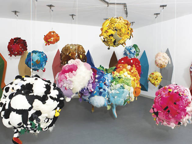
Mike Kelley, Deodorized Central Mass with Satellites, 1991-9

1. Sociology 

  • Within any given society, the dominant group(s) set the norms. People who through biology or choice do not fit those norms are excluded from full membership of that society. (Exclusion is not either/or: there are many degrees of exclusion, so many that most people experience it at some level.)
  • Kelley- In this work Mike Kelly has stitched together soft toys, they are second hand soft toys from hospitals, hospitals get through a lot of these toys because they can hang around for long as they become germ factory’s, and they are items that have a life and have reached the end of it. He has put them together by the basis of colour, and likeness, theirs another work with these balls and there is a part of this were sitting on the floor there is a yellowish toy, called Almost White and it makes the idea of exclusion and what puts them together.
  • It alerts us to the idea of this art work not us being about soft toys but also about the general workings of society. The formation of a group included some from of exclusion, who’s in and who’s out. You can’t have everyone in a group, there needs to be someone outside to make a boundary.

Slide05

  • When we come across otherness in art it may be presented in the form of exclusion, these figures are not life-size but they are not small, they are around 4ft high. Scale is important. We can’t look upon this this as equals as they are not the same size as us, they are not miniatures, its an awkward size that’s smaller than us but not so small that we can regard them as models.
  • When you come into the room they are all facing away from you, their backs are facing you, and you can walk around to the front.

Slide06

  • When you come around to the front they are all laughing, you stand at the place where they are laughing at, you are excluded when you are behind but when you see the faces you are then excluded because you become the butt of someones else’s joke.
  • There is another thing about this is that the faces are repeated, there’s a duplication, they are not fully individualised, the group identity is stronger than the individual.

What does the world look like?

Slide001

What counts as a realistic representation in the 21st century?

  • In a photograph there are areas when you can capture just half a car, that doesn’t match up with the visual impression, we move around in the world, we dont always stand still for a long period of time. The sense of the world is different to that of what you capture in a photograph. Our eyes are constantly moving, and land in more than one position at one time.
  • When we capture the moon in a photograph it is always disappointing, you see the low moon and it looks really big but its does not correlate in a photograph. One reason is that the moon isn’t as big as we think, and because we pay attention to it it occupies more of our visual receptors, so it appears larger than it it. With a moon near the horizon you can cover the moon with you thumb and it will be the same at the horizon and at the middle of the sky. But it appears bigger at the horizon because we have trees and houses that we can compare the size to. If we just look straight up it appears smaller as we have nothing to compare the size to.
  • With photography its difficult to know what is a realistic representation, should we go with that the camera records everything impersonally, and even if we think that’s not what the moon look like the truth is that is what look like- our perception is wrong and the camera is right.
  • Well that is wrong- the camera is a machine and the human view is that it is larger and bigger at the horizon.

What do we mean by realism?

Would a ‘realistic’ image look the same to everyone regardless of their culture?

Alternatively, if realism is dependent on culture, is it actually realistic at all?

  • The first idea is that there is a universal objective idea of realism, a realistic image, whatever it is, would appear realistic to every single person no matter upbringing, or time and place where you live. Because it was realistic wit would look like the world, and they would recognize the look of the world in that image.
  • The second alternative is that one culture realisms is not the same as another realism and just because something looks real in Chile, it does not mean it will look the same in Africa. and just because something look realistic in 2016 doesn’t mean it will look like this in 1320. Realism is a culturally relative term and there is no realism.

Slide009 (1)

  • How images, perception, and psychology.
  • Jakobson is a linguistic theorist,  he traveled from Russia, to Prague, and ended up in New York.
  • We can’t see or represent anything without referring to something else. consciously or unconsciously. In order to understand with as a table I need to have an understanding of a table in my head, if i have nothing like that, of a table, I might use the idea of a chair, and think of a table as a large stool. Id have something to make sense of what I am seeing.
  • If I don’t have that, would I be able to see the table properly or represent it properly?
  • In science fiction and horror stories if the writer wants to give you an idea of something from another dimension, they run out of words to describe the thing, trying to describe something in humans terms that is indescribable. The fact there is no schema is part of the horror.
  • none of us have ever seen a unicorn, but we have a schema for it, I have seen a horse with a long horn, we have an idea of a horse, but if we have no schema we can’t even put it into words.

Slide012

  • Durer’s image became a schema, it even carried on when people could see them.
  • There is the sharpness from the horn which related in both the drawing and the painting that are direct schema From one to another.
  • We know better now that what a rhino looks like, replaced one schema for another.

Slide014

  • We defer to photography as a truth.
  • We can see things that are bt quite right, and we remove things that dont belong, it still works as an image of a rhino but we’ve replaced the schema, and makes it appear as an exception.
  • When we think we know what it is we have to change the schema.

Slide011

  • Over time artists test the schema against their work “making and matching”
  • Giotto- The schema for the mountains is a tower, rough, and rocky.
  • Another artist’s might come along and understand this schema but might make the trees smaller which will make the mountain bigger, and further away.
  • You can modify and modify.
  • Poussin- His schema for the mountis is not the same but it is rocks, he could have used some rocks and painted them in his studio to represent the mountains, he uses pale blues when we accept the distance and what he is telling us.
  • Monet- He was in the snow and it is a direct perception, we tend to see this as more realistic, over time makler and matching is a feature of art the schema will become more realistic.
  • What ever schema you start with, if you make and match enough over time the image will become objectively more realistic.

Slide015

  • No one agrees on an absolute definition of realism, it changes over time, society and society.
  • Incompatible meanings for realism.
  • There is no agreed meaning for realism, if you look at how things change, like a painting, and people think that is realistic other people will then use this picture and mimic it themselves.
  • An individual image becomes mainstream and then becomes stale, it is perceived as being unreal.
  • The realism of yesterday becomes the realism of today, The effect of realism is created by breaking conventions. There is no objective truth, there will never be an image that will be realistic for all time. There is a short shelf life and it is constantly being renewed and changed.

Slide016

  • Vernet- He painted these seascapes and they were accepted as being realistic, but at the end of the nineteenth century these images had become stale.
  • Turner- Had to find a different way to paint the sea and in finding a different way of painting the sea he creates something that is realistic again and then again this image becomes stale.
  • Monet and Nolde find ways of representing it and the process of renewal means eac painting no matter how different and perceived as being realistic at the time of completion.
  •  As it slips into history it becomes normalised and conventionalized and then it becomes dull. Art has to overturn to create realism again.

Slide017

  • The mere look of 3D films becomes boring and cinema sand film makers have to come up with new ways to create them, IMAX does this well, now the seats shake etc. We have to restore that effect of realism.

Slide018

  • We have a notion of perspective and photography, and the two are deeply connected and embedded in our perceptive psychological apparatus, and when we look at an image like this we understand the space that is being described, and we accept that as being more realistic.
  • We are not certain of the conventions are when we first look at it. Is he a small man?
  • The visual culture that we find ourselves in.

Slide020

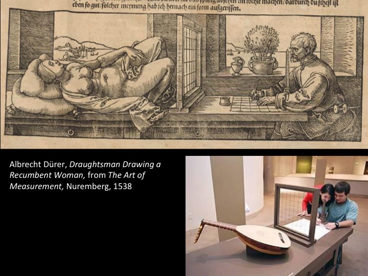
  • People look at this top image for the obvious critique of it, the process of drawing her objectifies her she becomes an object of vision for the man, her body is available for art. And perspective forms that turning another human being into a drawing.  The man is in the position of power and the woman is passive.
  • He may have more power but the apparatus that objectifies her controls him. There is this window between them with a grid of string and a piece of paper with correlating lines, and there is an obiblis. If he moves his head the view  is changed and he won’t produce the picture.
  • As soon as perspective is create artists start to play around with it.

Slide022

  • A funny shape in the foreground, there is a notch in the painting, you can then see a skull, you cant see them both at the same time, the idea of death intruding on the scene. Cannot occupy the same space, can’t see death unless you more right to the side.

Slide024

  • Constable- He had a piece of glass in a frame which he fix to his easel, there were four pieces of string he nailed into the corners of the frame and he would hold them tight in his mouth, closing one eye, he would trace in using printers ink what he could see. He would then press a piece of paper onto the glass and get the mirror image, flip it over and trace it again to produce the image that he saw around him.
  • Hes trying to find his homemade way of producing a photograph, it is really accurate, it should produce a convincing painting.

Slide025

Slide026

  • When you line up the drawing with the painting not everything lines up, in this image the trees line up but then the boats dont match. The houses don’t match.

Slide027

  • Again when you line up the boats then the trees dont match.
  • The whole picture doesn’t match, it goes through the process of marking and excluding his own subjectivity in the picture making process, and then he decided its not as realistic as he would like, he modifies the glass drawing.
  • He expands the central area, the things that we are focused on occupy more space.

Slide030

Slide031

  • The photograph records things that we couldn’t see, someone partially present.

Slide032

  • The idea of being there and not there “spiti photography” or “ghost photography”.
  • We have two images that are showing us things that we cant see, one is one scientific and one is a lie. It still relies on a belief we can’t verify what we are seeing, we have to believe that the photograph is accurately showing the world.
  • The truth of both of the images is rested on the belief of the authority of what photography is showing, as a visual means of reputation.

Slide033

  • He has someone perform an action, and it is recorded with very fast photos, from several different positions, each row if you were standing there, that is what there is to be seen. You couldnt occupy all the angles at the same time, photography opens the idea of totally visualization of a phenomenon, and true view, but impossible to see.
  • We can produce a knowledge of the world that is impossible to the unaided human perception, beyond what we can see. Means of recording what you can see but human vision is limited and machine vision can bypass human vision and show us things we could never see.

Slide034

  • He has marked up using white dots and lines so we can see the relative positions, we can follow the line and see what happens to the head etc. This is not what someone look like when they jump over the fence but we are not used to seeing it in this way.
  • A new way of depicting motion in space.

Contemporaneity

What makes a work of art contemporary?

  1. Does it depend on when it was made?
  • Yesterday?
  • 2000?
  • 1990?
  • 1980?

2. Is contemporary art a kid of style?

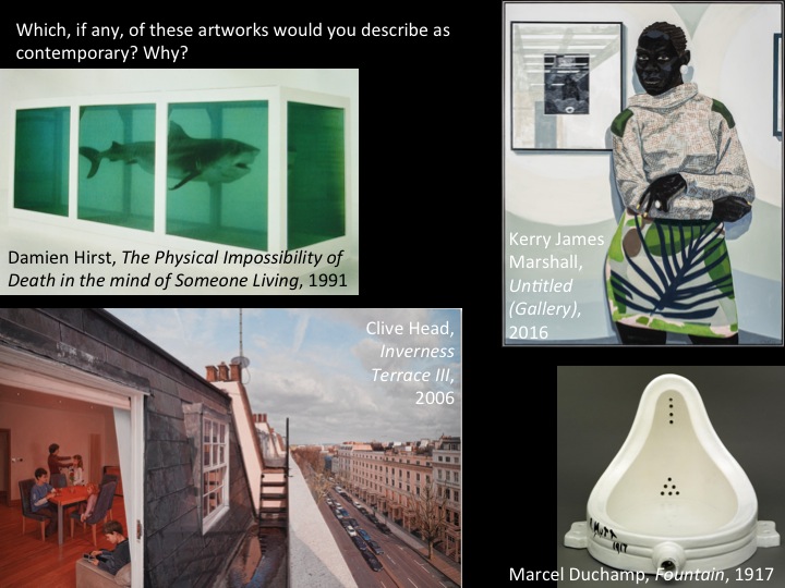
Which, if any, of these art works would you describe as contemporary? Why?

Slide06

Idea: 

  • In order to be contemporary an artwork must be relatively new, and it must also be about contemporaneity, that is, it must express, analyse, or embody something about the contemporary condition.


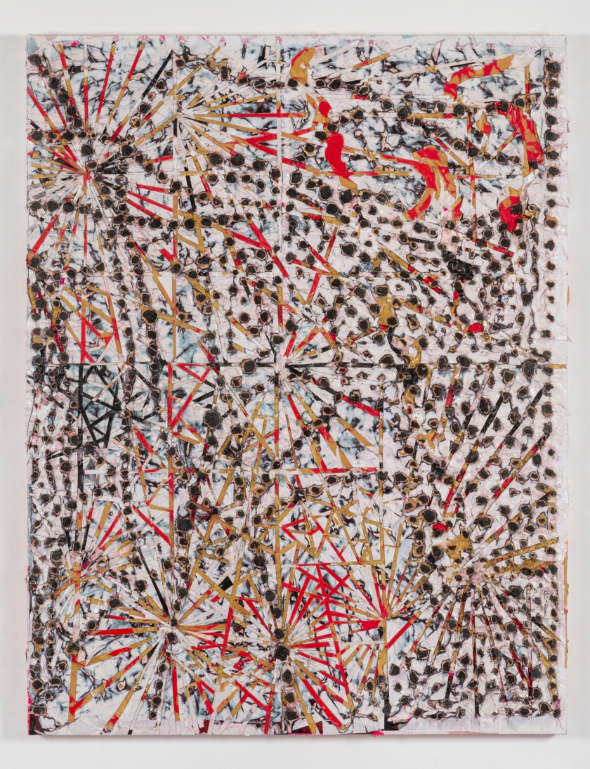
Does Mark Bradford’s work fulfil both conditions?

MB.03.jpg

“They’re all based on AIDS cells under a microscope. I don’t want to say the show is about AIDS, but it’s about the body, and about my relationship to the nineteen-eighties, when all that stuff hit. It’s my using a particular moment and abstracting it.” 

Mark Bradford interviewed by Calvin Tomkins, “What else can art do?” The New Yorker, June, 2015.


dc6fa03e06a55f901c7fabd99387c20e


Whats the difference between a Brillo box and an Andy Warhol Brillo box?

Arthur Danto’s idea that contemporary art is not self-sufficient; it relies on a text, or on a theory that it is not part of the artwork itself, and may not be visible in it.

Andy Warhol, Brillo Box, 1964


The anxiety about being in the moment.

Is today’s social and political situation so different from that of 30years ago. that we need a totally new form of art (a new ‘ism’) to deal with it?

Is today’s social and political situation so complex and fragmented that no single ‘ism’ can respond to it?

How do we define ‘now’?

Slide15

Slide16Slide17

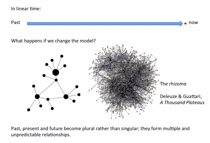
How have theorists given an account for contemporaneity in art?

Nicholas Bourriaud’s theory of altermodernism, as explained through a comic strip on Tate Britian’s website for Altermodern the Tate Triennial, created by Bourriaud, 2009.

237650


Slide41

Mark Godfrey: New Time Paradigm 

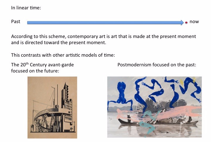
Contemporary  art is determined by its relation to time:

  • the present
  • the past
  • nostalgia for modernism
  • nostalgia for yesterday’s future
f6a6376844b1534f327166a2407563398cd87dd6
Fernando Bryce, Die Welt (detail) 2008


= ultra-modern

= anti-modern

talgia for yesterda


= situation where modern, traditional and chaotic art brought into temporary relation.


Kelly Baum: 

The form of art is linked to the form of subjectivity in any given society. Contemporary art is heterogeneous; not just in form: heterogeneity is its chief subject. Contemporary art reverses Greenberg’s project of disciplinary purity; it wants to see itself as non-art; it is involved in a process of self-othering (auto-defamiliarization).

Suzanne Hudson: The paradigm of no paradogm

Contemporary art is an idea, it has no real existence.

Whose interests are served by the belief in the existence of contemporary art?

The Market

The museum

The university ect

The biggest problem with contemporary art as it is currently understood it its fatherlessness.

2013_031
Eric Fischl, Art Fair Booth #1: Oldenburg’s Sneakers, 2013

Isabelle Graw: The service sector artist 

The artistic value of contemporary art is underpinned (and undermined) by its market value.

The figure of the contemporary artist is mythical, made up of those qualities that are thought valuable in the labour market at the moment.

‘Art’ has a value that is trans-individual and timeless; ‘contemporary’ has a vale that is based on the relevance and urgency: The two terms push in opposite directions.

Slide48Slide49Slide50