History Of: Prussian Blue

celestina
Pablo Picasso, La Célestine (La femme à la taie) (La Celestina), 1904 Musée Picasso Paris

Before Newton published his first report on the seven colours of the rainbow in Opticks (1704), a new blue was invented in Berlin, Germany. The dye-maker Johann Jocob Diesbach was working on a cochineal red pigment when he disregarded the fact that one of his materials, potash, had come in contact with animal blood. He figured that red mixed with red would simply create more red. Surprisingly, this was not the case, and his red dye emerged as a potent blue. The animal blood has spurred a chemical reaction, which created the compound iron ferrocyanide, know in German as the colour Berliner Blau or, in English, Prussian Blue.

French Rococo painter Jean-Antoine Watteau, Japanese woodblock print-maker Katsushika Hokusia, and Spanish master Pablo Picasso in his Blue Period all used the colour extensively. However, the success of Prussian blue goes beyond its role as a pigment. In 1842, the English astronomer Sir John Herschel discovered that Prussian blue had the unique sensitivity to light, which could be manipulated to create copies of a single drawing. Herschel’s method of image reproduction proved invaluable to architects, who for the first time could easily create multiple versions of their building plans, aptly named “blueprints” after their Prussian blue colouring. In contemporary medicine. Prussian blue has a very different purpose: It’s delivered in a pill form as an antidote to heavy-metal poisoning.


History Of: Indigo

larger
Unknown Artist Basinjom Mask and Gown Seattle Art Museum

The colours of the rainbow (a.k.a. Roy G. Biv) has a clear outlier: indigo. Commonly considered a shade of blue, indigo is not a separate colour in its own right. Indigo was a desired import throughout the 17th and 18th centuries, driving trade wars between European nations and the Americas, fuelling the African slave trade, and even partially funding the American Revolutionary War.

A natural dye rather than a pigment for painting, indigo was used to colour fabrics, clothing, yarn, and luxurious tapestries. Unlike lapis lazuli, whose rarity drive its high prices, the indigo crop could be grown in excess and produced across the world, from India to South Carolina.

Indigo dying was especially popular in England, home to physicist Sir Isaac Newton. Newton, who introduced the term “colour spectrum,” believed that the rainbow should consist of seven distinct colour to match the seven days of the week, the seven notes of the musical scale, and the seven known planets. Confronting the fact that the rainbow only displayed five unique colours, Newton pushed indigo, along with orange, much to the dismay of some contemporary scientists.

Synthetic indigo, developed in 1880, largely replaced the natural crop by 1913; this is the pigment that dyes blue jeans. Over the past decade, scientist have introduced a competitor to the market: Escherichia coli bacteria that is custom-engineered to produce the same chemical reaction that makes indigo in plats. This method, called “bio-indigo,” will likely play a big part in environmentally friendly dyes.

History Of: Ultramarine

larger
Sassoferrato The Virgin in Prayer, 1640-1650 The National Gallery, London

Sometimes called “true blue,” ultramarine is made from the semiprecious gemstone lapis lazuli, which for centuries could only be found in a single mountain range in Afghanistan. Egyptian traders began importing the stone as early as 6,000 years ago, using it to adorn jewellery and headdress. Yet they never figured out how to make a vibrant pigment from it. Riddled with minerals such as calcite, pyrite, augite, and mica, lapis loses its potency when it is ground up, turning it from a bright blue to a dull gray.

Lapis first appeared as a “true blue” pigment in the 6th century, gracing Buddhist faces in Bamiyan, Afghanistan. Around 700 years later, the pigment travelled to Venice and soon became the most sought-after colour in medieval Europe. For centuries, the cost of lapis rivalled the price of gold. Given its hefty price tag, the colour was reserved for only the most important figures, the Virgin Mary, and the most lucrative commissions, the church.

Legend has it that Michelangelo left his painting The Entombment (1500-01) unfinished because he could not generate the funds to buy ultramarine blue. Raphael used the pigment scarcely, applying it above base layers of azurite when depicting the Virgin Mary’s blue robe.

Given the high demand, in 1824, France’s Societé d’Encouragement offered a reward of 6,000 francs to anyone who could invent a synthetic version of ultramarine. A French chemist and a German professor both found the solution within weeks of one another, leaving the competition with contested results. Unsurprisingly, the French committee gave the award to the Frenchman and named the new pigment “French Ultramarine.”


History Of: Egyptian Blue

37977_l
Nebamun hunting in the marshes, fragment of a scene from the tomb-chapel of Nebamun, Late 18th Dynasty-around 1350 BC

Egyptian blue- the first colour to be synthetically produced- was invented in Ancient Egypt around 2,200 B.C., around the same time the Great Pyramids were built. To create the hue, Egyptians combined limestone and sand with copper-containing minerals (such as azurite or malachite) and heated the solution to between 1470 and 1650 degrees Fahrenheit. The end result was an opaque blue glass, which could be crushed up, combined with egg whites, glues, or gums, and made into a long-lasting paint or ceramic glaze. The process was easy to get wrong, and any mistake would result in a “glassy, green mess,” explains Victoria Finlay in The Brilliant History of Colour in Art (2014). While Egyptian blue remained popular throughout the Roman Empire, its complex method of production was forgotten as new blues came to market.

In 2006, nearly two millennia later, conservation scientist Giovanni Verri made an accidental find that brought Egyptian blue back to the fore. Viewing a 2,500-year-old Greek marble basin under fluorescent lights, Verri was surprised to find that the vessel’s blue pigments began to glow—a signal that Egyptian blue emits infrared radiation. This rare property enables scientists to find traces of the color in ancient artifacts, even after the pigment has been washed away or otherwise made invisible to the naked eye. Scientists outside of the field of conservation have also taken interest in Egyptian blue, adopting the pigment for biomedical analyses and laser development.


Oil Paint

sakura_cray-pas_colorchart.jpg

In oil painting the pigments are held together by oil, the most common type of oil is linseed oil. Oil paintings take a long time to dry which allows an artist to keep revisiting and working on a pianiting. There is no real idea of when oil paint was first used, but there are caves in Afghanistan decorated with ancient paintings which the paint has been mixed with oils, It is also believed that this type of paint was used in other countries of Asia as well.

Antonello_da_Messina_-_Virgin_Annunciate_-_Galleria_Regionale_della_Sicilia,_Palermo
Antonello de Messina, Madonna, 1470’s

Linseed oil, which is the main type of oil used for oil painting, comes from the flax seed. Flax has been an important crop for thousands of years, because linen cloth is made from it. This means that the oil for painting and the cloth for painting on both come from the same plant. To get different effects, artists would use mixtures of different oils. These include pine resin, frankincense, poppy seed oil, walnut oil, and in more modern times safflower oil.

Banquet_in_the_House_of_Levi_by_Paolo_Veronese_-_Accademia_-_Venice_2016_(2)
Paolo Veronese, Feast in the House of Levi, The largest oil painting in the world, it is more than 42 feet long, 5.55 x 12.80 meters.

It is believed that oil paint was used in Europe in the Middle Ages at first for decorating shields, because oil paint lasted better than the traditional paint of tempera (sometimes know as egg tempera, is a type of artist’s paint, it was the main medium used in panel painting and illuminated manuscripts in the Byzantine world and the middle ages in Europe.) when it was in the weather, or it was roughly treated.

800px-Rembrandt_Harmensz._van_Rijn_059
Rembrandt

The Renaissance art historian, Giorgio Vasari, said that the art of oil painting came from northern Europe and the person who invented it was the famous Flemish painter Jan van Eyck. The good thing about oil paint is that it can be used in all sorts of ways that most other types of paint cannot be used.

  • Oil paint can be put on thin or thick.
  • Oil paint can be almost as smooth as glass, or lumpy, bumpy or streaky.
  • Oil paint can be transparent so that the layers underneath can be seen, or it can dense so that it covers everything underneath.
  • Oil paint can be put on with brushes; it can also be scraped on with a knife, dobbed and smeared with fingers, rubbed on with a cloth, and squeezed onto the painting straight out of the tube.


Oil Pastels

fc-oil-pastel-chart

Like acrylic paint, oil pastels are an invention of the twentieth century, and is one of the new mediums that Pablo Picasso pioneered. Although the medium didn’t exist earlier than the 20th century, its roots go back further, oil pastels are related to 2,000 year old encaustics (painting with melted wax).

Oil pastels first appeared with Sakura Cray-Pas in 1925, the name comes from the bold invention of combining nontoxic crayons and pastels. This eliminated the dust but kept the strong colours and opaque intensity of traditional soft pastels. Modern artists enjoyed the freedom of drawing or painting on any available surface, but some saw this as a children’s product.

Colour Theory

Color_diagram_Charles_Hayter

theory-wheel-history

Colour theory encompasses a multitude of definition, concepts, and design application, there are three categories of colour theory: The colour wheel, colour harmony, and the context how colours are used.


The Colour Wheel

A colour circle based on red, yellow, and blue is tradition on the field of art, Sir Isaac Newton develop the first circular diagram of colours in 1666. Since then scientists and artists have studied and designed numerous variations of this concept. Differences of opinion about the validity of one format or another continue debate.

There are also definitions (or categories) of colour based on the colour wheel.

theory-wheels-3-6-12

Primary Colours: Red, yellow, blue.

  • In traditional colour theory (used in paint and pigments), primary colours are the three pigment colours that cannot be mixed or formed by any combination of colours. All other colours are derived from these three.

Secondary Colours: Green, orange, purple

  • These are the colours formed by mixing the primary colours, blue+red=purple, blue+yellow=green, red+yellow=orange.

Tertiary Colours: Yellow-orange, red-orange, red-purple, blue-purple, blue-green, and yellow-green.

  • These are the colours formed by mixing a primary and secondary colour.


Colour Harmony

Harmony can be defined as a pleasing arrangement of parts, whether it be music, poetry, or colour. Harmony in visual is something that pleases the eye. It engages the viewer and it creates an inner sense of order, a balance in the visual experience. When something is not harmonious, it can be either boring or chaotic, at one extreme the visual experience that is so bland that the viewer is not engaged. At the other extreme is a visual experience is so overdone, so chaotic that the viewer can’t stand to look at it.

Extreme unity leads to under-stimulation, extreme complexity leads to over-stimulation. Harmony is a dynamic equilibrium.

1. A colour scheme based on analogous colours:

ctheory_leaf

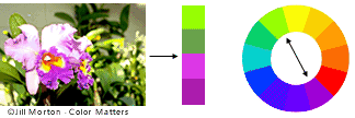
Analogous colours are any three colours which are side by side on a 12-part colour wheel, such as yellow-green, yellow, and yellow-orange.

2. A colour scheme based on complementary colours:

ctheory_orchid

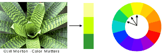
Complementary colours are any two colours which are directly opposite each other, such as red and green, red-purple and yellow-green. There are many variations of yellow-green in the leaves and several variations of red-purple in the flower. These opposing colours create maximum contrast and maximum stability.

3. Colour scheme based on nature:

cteory_nature

Nature provides a perfect departure point for colour harmony.


Colour Context

How colour behaves in relation to other colours and shapes is a complex area of colour theory. Red appears more brilliant against a black background and somewhat duller against a white background. In contrast with orange, the red appears lifeless; in contrast with blue-green, it exhibits brilliance. The red square appears larger on the black than on any other background.

ct-4redsq


Light in Art:

How Caravaggio, Turrell, and other artists revolutionised the use of light in art:

The_Calling_of_Saint_Matthew-Caravaggo_(1599-1600)
             Michelangelo Merisi de Caravaggio The Calling of St. Matthew, 1599-1600.                   San Luigi dei Francesi, Rome

“Light is not so much something that reveals, as it is itself the revelation.”

For centuries, revolutionary artists like Turrell have harnessed light to manipulate it as both subject an medium. Throughout many periods within art, light has served as the most common material that is revisited time and again; each time, the artist changes our understanding of what constitutes a work of art.

Michelangelo Merisi da Caravaggio, better known simply by Caravaggio, is recognised for his skillful style of painting that uses light to dramatically highlight specific points in his compositions. His iconic work The Calling of St. Matthew is purposefully placed below a real window in a church where it currently hangs, to create the effect of light emanating from the opening into the painting. The stark contrast between light and dark creates a theatrical, atmospheric painting.

12d43d497ce3ae48299e94b562571fd8
                                          Claude Monet- Rouen Cathedral, West Facade, 1894.                                                  National Gallery of Art, Washington D.C

With the invention of tubed paint in 1841, artists were able to take their practices outside of their studios and into nature, Art En Plein Air. The provided working area with pure and immediate studies of how sunlight interacts with its surroundings, pioneered by the Impressionists. Claude Monet captured the ethereal subtleties of colour and light in his painting entitled Rouen Cathedral, West Facade. The soft gradient of blues outlines the structure, capturing the cathedral in the morning haze.


larger
 Paul Strand- New York, Negative 1915; print 1916,                                                       J.Paul Getty Museum

Impressionists like Monet blurred the lines of reality by replacing hard lines with soft stokes, photographers sharpened their skills at replacing real life using cameras to capture rich shadows and bright highlights. Much of the Impressionists emphasised passing moments by capturing the varied coloration’s of light at a single point in the day. Photographers focused on an exact moment in time.

Paul Strand’s New York demonstrates how the photographer used the time of day and the sun’s harsh shadows as fundamental elements in his composition. Rather than reiterating a familiar scene of pedestrians walking to work, Strand brings the viewer’s attention to the imposing shadows inside the building’s recesses.

larger
                                      Dan Flavin- Untitled (To Pat and Bob Rohn) 1969,                                      Judd Foundation, New York

While photography’s strength lay in depicting depth through light and shadow, it still remained a two-dimensional medium. Seminal light artist Dan Flavin created art that could blur the boundaries of space by manipulation the principles of sculpture. With his light works, constructed with fluorescent tubes, he created sculptures that were diffused into their surrounding spaces. Flavin used light’s inherent radiating quality as both subject and medium, entering into a new territory in art history.

Light and Colour

dispersion-of-white-light

Light:

  • The natural agent that stimulates sight and makes things visible: “the light of the sun”

synonyms:  illumination, brightness, luminescence, luminosity, shining, gleaming, brilliance, radiance, lustre, glowing, glow, blaze, glare.

  • An expression in someone’s eyes indicating a particular emotion or mood: “a shrewd light entered his eyes”
  • Provide with light or lighting; illuminate
  • Make (something) start burning; ignite
  • Having a considerable or sufficient amount of natural light; not dark.
  • (of a colour) pale.

Colour:

  • The property possessed by an object of producing different sensations on the eye as a result of the way it reflects or emits light: “the lights flickered and changed colour”

Synonyms: hue, shade, tint, tone, tinge, cast, tincture 

  • Pigmentation on the skin, especially as an indication of someone’s race: “discrimination on the basis of colour”
  • Change the colour of (something) by painting, dying, or shading it.
  • (of a person or their skin) show embarrassment or shame by becoming red; blush.