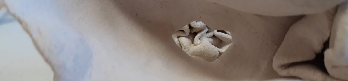
During my making process I have started to work more with a more graphic style, from working with line to now exploring photography. I really like the way the above image captures the folds within the ceramic. My work has taken a turn into colour and how I can convey it to others.
I really like the work of Heather Knight, her use of porcelain with the organic form is something that I am also channelling within my own practice. I look towards her as to how she has build up her business, how she promotes her work, and how she costs her work. I also like how she displays her work, she uses grey backgrounds which really highlight the porcelain.
Colour has become one of the main focal points within my practice, but not just any colour, the colours that are naturally found within the material. I want to keep exploring my practice, and these square tiles by Heather are a great inspiration.
Where am I going to take my work? Where do I see the progression of my own practice? I think as I start exploring my work further I want to look into home decor more, from tiles, to wall fixtures. But, I really need to spend time exploring form and scale before I can make decisions about where to take this work further. Would my style be effective translated into further styles and presentation?
I really find the work of Simon Kidd inspiring the use of porcelain to create these abstract and organic works is something I’m trying to translate into my own practice.
My work has become very soft with pinch forming and this harder edge is something I could think about further into my own work, how can I keep inventing and exploring form? Can I mix this harder style into my own practice? And, would my own work blend into this rougher, harsher style?
I found this image when looking into ceramic home deign, now I’ve done some digging on the internet and found that these tiles are made in Spain by a company called Harmony.
I really like this bold and graphic approach to ceramics and tiles for within the home, I have been thinking about how I can translate my work into the home and I think this could help inspire my practice more.
The bold design that repeats is really visually capturing, and as I have been working into pinch forms I would like to explore this further. Could my work live as tiling?
How I display my work has become the main thought at the moment, do I attach them onto walls, stick them on plinths, have them piled on the floor? All of these ways of displaying are interesting but does it work with my work?
Where does this work live, and is what I want to communicate fully shown in this setting?
I don’t think it is, I have started to explore the natural colour of a material, and the concrete does nothing to highlight colour, if anything it just absorbed it all out. So, where can I display this? I think a wall piece could work, but I have to explore interior more and deeper as I continue to make.
198 of my porcelain forms on the way to the kiln for bisque firing.
When taking my work down to the kiln I piled them all out on a whiteboard for easy travel. I really like the way they all pile and spill over each other which gets me thinking about where else my work can live.
I have explored my work living in a domestic setting, but now i’m starting to think what about a wall piece/ panel? Working with ceramic has really opened the way I am thinking about the domestic, and I think my contemporary take on ceramics will work really well within the domestic setting.
To Do:
Cut and measure MDF,
Think about how I will stick my work on to a board,
I really like the direction my work has started to move into, the mixing of hand made ceramics and the use of digital technology to bring forward my ideas. But, what can I do with these colours? I have been thinking about design and exploring the interior. I was thinking about creating a design colour book for client, they could look through the different colours and select their own custom colour from the book, or, I could create a new colour for them that fits their needs.
I really want to step into interior design, and this is a good way of getting my work in one place and accessible for clients.
What is about subtly that informs my practice? Day to day I find myself looking at the world around me and I can see the colours hidden in plain sight. I spend a lot of my time on my own, in deep reflection and so I start to see the hidden world around us.
In my work with porcelain I have been looking into the subtle colours within the material when it is bisque fired, but that’s not the only place I see these hues. In the below image of my hand you can see the fine lines and details of my palm, but you can also see the subtle changing of colour and hue within my skin. The light and dark of highlights and shadows. This image really helps to apply context within my work, its a way of showing the viewer what I see.
Close up detail of my right hand.
Showing the viewer is one thing, but I have started to make even deeper connections to myself and the materials I use. When working in porcelain everything is pinch formed by hand, and now my hand is now reflecting the subtitles I wish to expose. There is always an ongoing conversation within my work, and its how I bring others into this conversation that will begin to open my work up further.
Is my work all show and now tell, or a mix of the two? How much am I willing to allow the viewer to gain without my prompting.
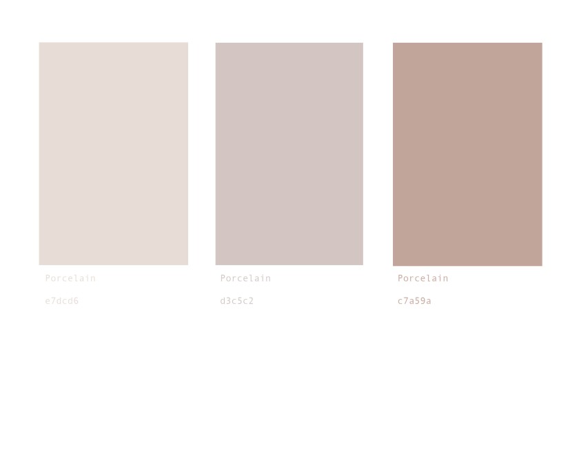
My image and the colours broken down using Photoshop.
Working with porcelain I can really see the colours that are within the material, but how do I get others to see what I see? I have a background in graphic design before I started this university course, so I have been working more and more with Photoshop and graphic applications.
Taking one of my images into Photoshop I am able to pull out the colours and the codes that make up the colour, (as shown at the bottom of the above image) and then arrange them into palettes.
I really like working in this more graphic style, and it has got me thinking into how I can display and show this way of working. One of the main requirements for this year is a book, so I think as well as my artist book I might create a graphic print book detailing the colours I see within porcelain.
Exploring how my work sits and interacts within different situs is now one of my main challenges, where does this work live outside of the studio and a gallery space. And if my work lives in the domestic setting how do I price point my work?
My own pricing for the three little porcelain objects would be £20-£25, but what do others say?